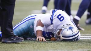
Sports Editor-Rexburg Standard Journal

10 Apr

In the fall of 2017 I interned for the Standard journal in Rexburg, I was an intern and later became the sports editor. Here is one of my stories published in the paper.

North Fremont Huskies vs. West Jefferson Panthers

On Tuesday night the North Fremont Huskies would take on the West Jefferson Panthers at home. The Panthers would get the best of the Huskies however the Huskies wouldn’t back down making the third set very competitive, losing however 25-20.

The first set of the match was very back and forth, the Huskies at the start of the set took a bit of a lead 8-3, however the Panthers got on a little run taking the lead 11-10, and forcing the Huskies to take their first timeout.

As the set nears an end the Huskies were having trouble getting the ball over the net, while the Panthers are putting themselves in a good position to take the set the score 21-18. A bad serve from the Huskies would end the set 25-19. The Huskies let up towards the end at couldn’t make it back from a run put on by the Panthers.

The second set has the Panthers still controlling the game and the Huskie coach is forced to burn a timeout. The score 7-4, hoping to grab momentum back Saylor Jeppesen hit an impressive spike to the other side of the court within the lines.

The Panthers pulled away in the second set the score is 18-9. The Panthers have had a lot of rallies where they have found the holes in the Huskie defense. Currently on a huge run the Panthers have nearly completed their second set win. They would go onto win another set off a bad serve from the Huskies. The Huskies will need a lot of quick changes to overcome this 2-0 deficit. The Panthers ended the second set on an 18-7 run.

The Huskies need to get off to a quick start or this will be the final set of the match. Kylie Anderson of the Huskies made a great diving hit that found a hole in the defense of the Panthers making the score tied at 10. The next rally would also be with the Huskies forcing the Panther coach to take a timeout.

Alex Lerwill and Kristie Hawkes played good up front this set and blocked a few of the Panther spikes and extending their lead to three. The Huskies let a couple chances slip from them and they lost their lead, the score now 18-18.

A timeout called late in the third set by the Huskies to regroup and not let the game slip from them. The game would end on a 7-2 run by the West Jefferson Panthers the final the score of the set 25-20.

 

Troy Prigmore

10 Apr


Troy .png


Introduction

My name is Troy Prigmore, I am a student at BYU-Idaho who is seeking to become a Minor League Baseball General Manager one day. I will graduate in December of 2018, with a degree in communication emphasizing advertising. I am experiencing is sales as I have been interning for the Idaho Falls Chukars for two seasons now. In this portfolio, you will see my skills in writing as well as designing.


Sports Editor- Rexburg Standard Journal 

In the fall of 2017 I interned for the Standard journal in Rexburg, I was an intern and later became the sports editor. Here is one of my stories published in the paper.

North Fremont Huskies vs. West Jefferson Panthers

On Tuesday night the North Fremont Huskies would take on the West Jefferson Panthers at home. The Panthers would get the best of the Huskies however the Huskies wouldn’t back down making the third set very competitive, losing however 25-20.

The first set of the match was very back and forth, the Huskies at the start of the set took a bit of a lead 8-3, however the Panthers got on a little run taking the lead 11-10, and forcing the Huskies to take their first timeout.

As the set nears an end the Huskies were having trouble getting the ball over the net, while the Panthers are putting themselves in a good position to take the set the score 21-18. A bad serve from the Huskies would end the set 25-19. The Huskies let up towards the end at couldn’t make it back from a run put on by the Panthers.

The second set has the Panthers still controlling the game and the Huskie coach is forced to burn a timeout. The score 7-4, hoping to grab momentum back Saylor Jeppesen hit an impressive spike to the other side of the court within the lines.

The Panthers pulled away in the second set the score is 18-9. The Panthers have had a lot of rallies where they have found the holes in the Huskie defense. Currently on a huge run the Panthers have nearly completed their second set win. They would go onto win another set off a bad serve from the Huskies. The Huskies will need a lot of quick changes to overcome this 2-0 deficit. The Panthers ended the second set on an 18-7 run.

The Huskies need to get off to a quick start or this will be the final set of the match. Kylie Anderson of the Huskies made a great diving hit that found a hole in the defense of the Panthers making the score tied at 10. The next rally would also be with the Huskies forcing the Panther coach to take a timeout.

Alex Lerwill and Kristie Hawkes played good up front this set and blocked a few of the Panther spikes and extending their lead to three. The Huskies let a couple chances slip from them and they lost their lead, the score now 18-18.

A timeout called late in the third set by the Huskies to regroup and not let the game slip from them. The game would end on a 7-2 run by the West Jefferson Panthers the final the score of the set 25-20.
 

Prezi-Design

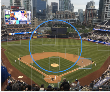
In this project, I showed my design skills by using the software of Prezi. In the presentation, I went through and shows the different roles of each baseball position.


Screen Shot 2016-10-05 at 2.48.19 PM.png


Contact Info

Phone: 760-975-9980

Email: troyprig@gmail.com

Twitter: @troyprig

Linkedin: Troy Prigmore

Portfolio

8 Dec

Screen Shot 2016-12-07 at 7.00.15 PM.png

PROJECT CORRECTIONS/TIME SPENT
I spent about three hours making corrections on my coding project and montage project.

DESCRIPTION
Design a portfolio that showcases all projects from my Visual Media course.

PROCESS (Programs, Tools, Skills, FOCUS principles)
1. I made the masters copy of the portfolio.
2. i then went and did all corrections as well as all of the keft side pages.

CRITIQUE PROCESS
I was at the tutoring center and they helped a lot with the colors as well as critiquing I fell my project is good. I also got a lot of help with my blog post as well as the fonts and designs I should choose in my project.

MESSAGE
I want to showcase my work in a professional way.

AUDIENCE
Potential client and employers.

TOP THING LEARNED
Just do it right the first time.

COLOR SCHEME & COLOR NAMES
Complimentary//Yellow and Grey

TITLE FONT NAME & CATEGORY
Cloud//Sans Serif

COPY FONT NAME & CATEGORY
Cloud Light// Sans Serif

Corrections

6 Dec

I spent about 2 hours and 45 minutes doing these corrections.


Magazine Project:

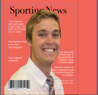
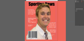
I first changed my title font from Impact, to Bondi 72 oldstyle. By changing that font, I was able to make it contrast with my Arial font a lot better. The next thing I did was I changed the font size so that they were all in good symmetry. I then eliminated all widows as well as all hyphens. The last thing I did was moved my image down a bit and also I made the barcode smaller. I spent about 40 minutes on this assignment. The original picture is on the left and the new one is one the right.


Screen Shot 2016-12-05 at 4.39.26 PM.png


Screen Shot 2016-12-05 at 4.39.41 PM.png


Prezi:

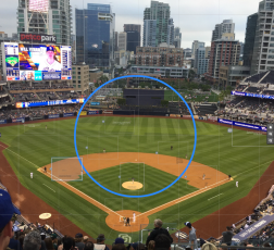
This one took a bit longer about 25 minutes editing my Prezi. I changed the fonts of my titles to be a little bigger and to contrast the body font. I also made sure the body text was not centered. I also got rid of hyphens and orphans. I changed the colors to what I think would look best on the field. I spent about 35 minutes on this assignment.

Screen Shot 2016-12-05 at 3.37.44 PM.png

Photoshop:

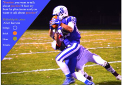
The first thing I changed was the fonts. I feel like I did a better job at making the fonts more contrasted. I also make the vibrance and the saturation of the picture different so that the picture’s color would still be bright but not as over powering. I spent about 50 minutes on this assignment because there was so many choices for filters and then the overlay.The original picture is on the left and the new one is on the right.


screen-shot-2016-12-05-at-4-56-57-pm      Screen Shot 2016-12-05 at 4.59.28 PM.png

Montage:

For the montage this one took long, it was hard to figure out which layer was good. I figured it out though and I also added an overlay. The overlay was sand which turned out to be good. I only had one filter in the first project but I changed it to where now there are to and they complement each other more. I spent about 40 minutes on this project.


Screen Shot 2016-12-05 at 4.38.12 PM.pngScreen Shot 2016-12-05 at 4.28.27 PM.png

Brochure

1 Dec

Screen Shot 2016-11-30 at 5.35.41 PM.png

Screen Shot 2016-11-30 at 5.35.13 PM.png

Screen Shot 2016-11-30 at 5.35.59 PM.png

DESCRIPTION
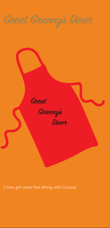
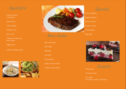
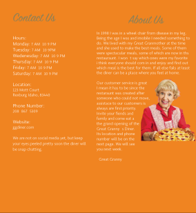
Design a brochure for a restaurant

PROCESS (Programs, Tools, Skills, FOCUS principles)
1. I first created the logo in Illustrator.
2. Then I went into InDesign and started to design my brochure. I wrote my body copy and added the body copy so I knew how I want it to fit.
3. I saved the images as Photoshop documents so when I was in InDesign I could edit the original and it would open in Photoshop. Then I could edit the coloring, etc and it would automatically update the link in InDesign.
4. I then exported the brochure document as JPEGS.
5. I then went back and put all my text in the project, and aligned then how I thought it would look best.

CRITIQUE PROCESS
I met with Sam and Orion they are oth in the same class. They were really helpful in the suggestions they gave. I originally had an image of an apron from teh internet but hey advised me that  I s hould design it myself.  Sam helped me to realize some placement of the text could be switched up. I made those changes and it was very helpful for the final product. I also got great help from the tutor and I feel good about this project.

Facebook Critiques: Sam Stephenson
One-on-One Critique: Hanna Wright
Instructor Critique: The tutor said i should choose a different font for my bod copy.

MESSAGE
To inform the world about the uality food that is here.

AUDIENCE
All people who need food to live

TOP THING LEARNED
Typography is not that hard.

COLOR SCHEME & COLOR NAMES
Complementary // orange

TITLE FONT NAME & CATEGORY

SignPainter // Script

COPY FONT NAME & CATEGORY
Golden Sans // Sans Serif

SOURCE OF EACH IMAGE (website name and hyperlink)

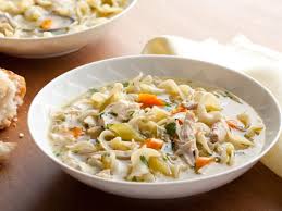
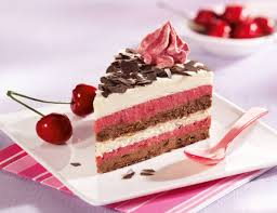
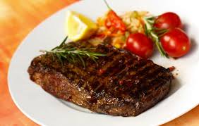
Chicken Noodle

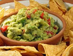
Chips and Guac

New York

Cheesecake

imgres-1.jpgimgres.jpg

imgres-3.jpgimgres-2.jpg


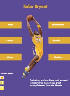
Kobe Website

17 Nov

Kobe 1.jpg


DESCRIPTION
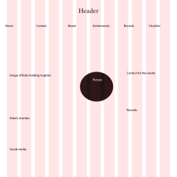
Design a website homepage using a grid.

PROCESS (Programs, Tools, Skills, FOCUS principles)
1. I first picked an idea of what I was going to use for the basis of my website.
2. I changed from my business logo I just feel it didn’t show enough effort.
3. I then started sketching an idea of how I wanted to lay it out. I knew I wanted some images of cats at the beginning to grab viewers’ attention and be easy to navigate.
4. After I sketched it on paper, I then jumped into Photoshop and opened the 16-column grid. I started to create my wireframe to get me started.
5. I then designed it in photoshop, and it was hard but I like what I ended up having.

Kobe2.jpg


IMG_0818.JPG


CRITIQUE PROCESS
I got help from a couple people, Sam as usual but also my friend Orion and then the tutors. I think the biggest thing I always struggle with is the typography, the tutor helped me shape it though so I think it is good. then also I got help with my colors as usual.

MESSAGE
The career of Kobe

AUDIENCE
Anyone who loves basketball

TOP THING LEARNED
Designing for web requires you to think in a new perspective such as user experience, interaction.

COLOR SCHEME & COLOR NAMES
Split Complementary // Yellow and Purple

TITLE FONT NAME & CATEGORY
Sans Serif // Futura Condesend


Out of Shape Website

7 Nov

Screen Shot 2016-11-07 at 4.14.35 PM.png


DESCRIPTION
Code a custom webpage with HTML and CSS.

PROCESS (Programs, Tools, Skills, FOCUS principles)
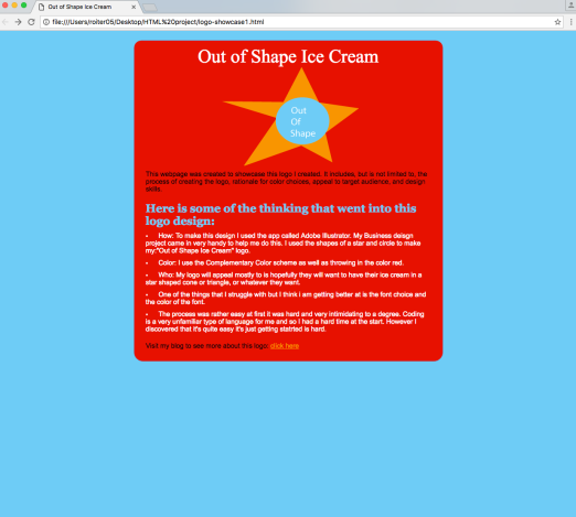
1. First I created my logo in Illustrator. I love cats so I decided to go that route.
2. I resized my logo to be 300 px on the long side.
3. I created my HTML file and started adding my content and tags.
4. Then I created my CSS file and made sure to link it in the HTML code.
5. I made customizations in my CSS to match the colors in my logo and changed the fonts to what I preferred.
6. I created the background by creating an image with the yellow gradient and then used that image as my background in my HTML code.
7. I then made sure to validate my HTML and CSS.

CRITIQUE PROCESS
I met with tutors from the lab and honestly they pretty much walked me through the whole thing. It was so helpful though the biggest thing I got help from was the colors as usual, and also complementing all the colors.

Facebook Critiques:
One-on-One Critique: Hanna Lee

MESSAGE
Get any kind of cone in any shape.

AUDIENCE
Everyone but mostly kids.

TOP THING LEARNED
When validating, it’s best to try to fix one error at a time because that will most likely fix the rest of the problems. Also coding is not that hard.

COLOR SCHEME & COLOR NAMES
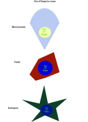
Complementary // Blu and orange

TITLE FONT NAME & CATEGORY
Arial// Sans Serif

COPY FONT NAME & CATEGORY
Minon pro// Slab Serif

Kobe

31 Oct

KOBE.jpg

DESCRIPTION
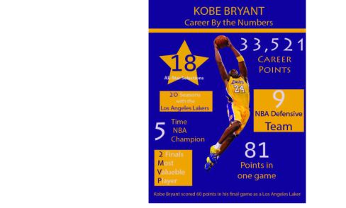
Create an infographic that organizes data in a visually pleasing way.

PROCESS (Programs, Tools, Skills, FOCUS principles)
1. I started brainstorming some topics and ended up with the idea of the seasons.
2. I did some research to find some data and found a study where Americans were asked what their favorite season was.
3. I drew out what  i thought was a good idea.
4. I then sketched out some graphics that I knew I wanted to include in the infographic.
5. Next I opened up Illustrator and started on my Infographic.
6. I figured a circular graph wasn’t the best and I went for more of a horizontal look.

GetFileAttachment.jpg

CRITIQUE PROCESS
I met with Sam and hanna for my critique. I also had a tutor look over my project.  They were really helpful in the suggestions they gave. Sam helped me make sure that all the requirements were met. Since Facebook and the professor are not an option this week i also had the tutor look over to help. Hanna made sure I selected the correct colors. . They had some other minor suggestions like changing the title to make better sense.
One-on-One Critique: The tutor
Critique: Hanna Wright, Sam Stephenson

MESSAGE
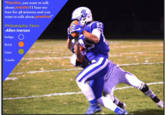
To inform about Kobe’s career

AUDIENCE
Anyone who is interested in learning about American’s opinions of their favorite season.

TOP THING LEARNED
Don’t neglect alignment.

COLOR SCHEME & COLOR NAMES
Purple, Yellow// Complementary

TITLE FONT NAME & CATEGORY
Myraid Pro // Sans Serif

COPY FONT NAME & CATEGORY
Lithos Pro // Sans Serif

26 Oct

Out of shpae letterhead.jpg

Front business Card.jpg

Back Business Card.jpg

DESCRIPTION
Create a logo for a company/service/organization and establish a visual identity across documents.

PROCESS (Programs, Tools, Skills, FOCUS principles)
1. I first sketched out some ideas for the logo on paper. I had a lot of different options.

2. After sketching, I opened up Illustrator and started creating some of my sketches digitally.
3. I had some good ideas I felt however were very basic.
5. I wanted to go for something that was happy and simple, I thought ice cream was great
6. I got opinions and we decided my final star was a lot better then my original.
7. I chose the illustration logo and then created my letterhead and business card.
8. I made sure to follow the rule of alignment and repetition.

CRITIQUE PROCESS
I met with a friend who helped me with the colors because as usual that’s a struggle. He advised me to use different colors as well as include a different font. Sam also told me that I should bring down my text boxes and center them more, to help with my alignment.

Out of shape.jpg

One-on-One Critique: Sam Stephenson
Instructor Critique: It was recommended that I change my logo, and my phone number and other copntact info. I also needed to make sure the picture and cards were the right size.

MESSAGE
Lets eat some ice cream.

AUDIENCE
BYU-Idaho students who are interested in changing the dating culture at the university.

TOP THING LEARNED
A color scheme can make or break your design. As well as alignment.

COLOR SCHEME & COLOR NAMES
American Typewriter// Slab Seriff

TITLE FONT NAME & CATEGORY
Myriad Pro// San Seriff

Tony Romo

19 Oct

Screen Shot 2016-10-19 at 5.14.19 PM.png

DESCRIPTION
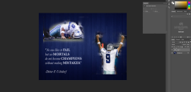
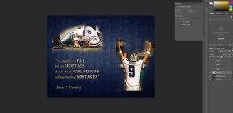
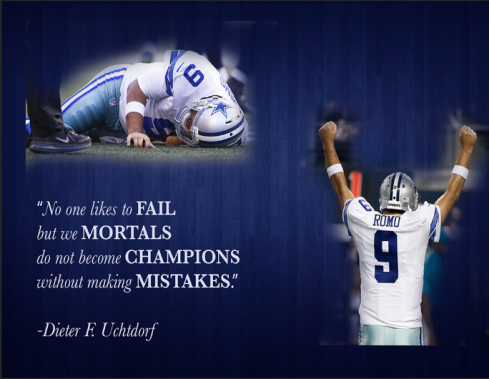
Design a spiritual poster montage using the blend of images and type.

PROCESS (Programs, Tools, Skills, FOCUS principles)
I had an idea of the montage I wanted to create to start out with. I wanted to create a montage that brought spirituality with sports. Here is the process I followed:
1. In Photoshop I combined all the various pictures I used to create the montage effect. I used a variety of layer masks and the brush tool to create the gradual blended effect.
2. I then found a quote by President Uchtdorf that I liked and added the text on the image.
3. I made sure to abide by the design principles such as alignment, repetition, and typography.

CRITIQUE PROCESS
I met with Hanna Lee, she gave me good insights bout my design. I think when I showed her my design it was good however she advised that I change my font in the text and also using capital letters would help the text have more life. Also I used to have a star in the middle but she said to make the images bigger rather then add more.
One-on-One Critique: Hanna Wright

MESSAGE
An uplifting message of hope and self-worth and our mistakes make us better.

AUDIENCE
All those who are touched by inspirational messages.

TOP THING LEARNED
Less is more.

COLOR SCHEME & COLOR NAMES
Complementary // Navy Blue // Silver

TITLE FONT NAME & CATEGORY
Bakersville Italic// Serif

COPY FONT NAME & CATEGORY
Bakersville Semibold //  Serif

THUMBNAILS OF ANY ORIGINAL, UNEDITED IMAGE(S) USED IN THE PROJECT

tony-romo-hurt-sea.jpg 940x.jpg  plain-royal-blue-backgrounds.jpg


SOURCE OF EACH IMAGE (website name and hyperlink)
1. http://sportshub.cbsistatic.com/i/r/2016/08/26/71520264-2762-4382-9b30-506c6fdb2404/resize/670×377/81311e8ad064a62a61e0e2caa315c15e/tony-romo-hurt-sea.jpg
Tony Romo Hurt

2. http://binaryapi.ap.org/70ff18dd5c544da98fc70d6b683bee40/940x.jpg
Tony Romo Celebrating

3. http://tenhdwallpapers.com/walls/49/plain-royal-blue-backgrounds.jpg
Background